Grantome details the trajectories of the NIH Grant "have" institutions
May 8, 2014
This is a fascinating read.
Grantome.com is a project of data scientists who have generated a database of grant funding information. This particular blog post focuses on a longitudinal analysis of some of the most heavily NIH-funded Universities and other research institutions. It shows those which are maintaining stable levels of support, those in decline and those which are grabbing an increased share of the extramural NIH pie.
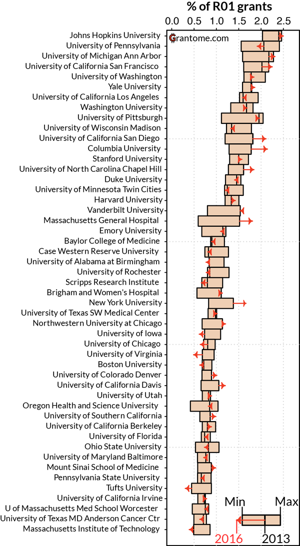
The following graph was described thusly:
Each histogram bar represents the range in the percentage of grants that has been held between 1986 and 2013. The current, 2013 level is represented by a black vertical line. Finally, arrows inform on the latest trend in how these values are changing, where their length and direction reflect predictions in the level of funding that each institution will have over the next 3 years. These predictions were made from linear extrapolation of the average rate of change that was observed over the last 3 years.
This serves as an interesting counterpoint to the discussion of the “real problem” at the NIH as it has typically centered around too many awards per PI, too much funding per PI, the existence of soft-money job categories, the overhead rates enjoyed by certain Universities, etc.
I am particularly fascinated by their searchable database, in which you can play around with the funding histories of various institutions. Searches by fiscal year, funding IC are illuminating, as is toggling between total costs and the number of awards on the graphical display.

May 8, 2014 at 10:00 am
EATTE THE RICH!!11!!1!!11!
LikeLike
May 8, 2014 at 11:47 am
I find the post after that one (“The Rich and the Rest”) interesting as well, if not very surprising. 20 institutions get 34% of the R01 action and 50 institutions account for 60%.
LikeLike
May 8, 2014 at 12:37 pm
Does that seem wrong to you, AL? If so, what is the proper distribution?
LikeLike
May 8, 2014 at 1:58 pm
When they say that the rich are growing they use percent of the grant pool. That is not quite right. A relatively smaller decline would lead to increased percentage. I think it just says the rich are more competetitive for dollars. That was sloppy language I think.
LikeLike
May 8, 2014 at 2:09 pm
Does that seem wrong to you, AL? If so, what is the proper distribution?
I’m in one of the favored 50 (though not, alas, in one of the illustrious 20) so I can’t really complain. As for the proper distribution, that would be any distribution in which I remain steadily funded, of course.
LikeLike
May 9, 2014 at 8:05 am
Thought you’d be interested in this: http://www.gpo.gov/fdsys/pkg/FR-2014-05-05/pdf/2014-10196.pdf, which I saw only through the APS (Amer Physiological Soc) on Facebook — but not (yet) announced through Sally Rockey or other channels:
DEPARTMENT OF HEALTH AND
HUMAN SERVICES
National Institutes of Health
Center for Scientific Review
Announcement of Requirements and
Registration for New Methods To
Detect Bias in Peer Review
SUMMARY
:
The Center for Scientific
Review (CSR) is seeking ideas for the
detection of bias in NIH Peer Review of
grant applications in a challenge titled
‘‘New Methods to Detect Bias in Peer
Review.’’ This notice provides
information regarding requirements and
registration for this challenge.
DATES
:
Submission Period: May 5, 2014
through 11:59 p.m. Eastern Time, June
30, 2014.
Judging Period: July 16, 2014 through
August 29, 2014.
Winners Announced: September 2,
2014.
LikeLike
May 9, 2014 at 9:15 am
Excellent. Very much needed.
LikeLike
May 9, 2014 at 1:10 pm
@Pinko – good point.
I agree this analysis is very interesting. As DM and others have laid out so well, however, a bigger problem is the shrinking pie (in real terms) and, I guess, the increased mouth count. I worry bit, when we compare rich & poor institutions or labs, that we are at risk of fighting each other over crumbs doled out by the powers that be. Even at the “rich” institutions, I doubt the living is easy these days. I don’t want our community to fall into infighting when we should be advocating for more support all around.
LikeLike
May 10, 2014 at 12:18 pm
[…] a recent post, DrugMonkey pointed out an interesting analysis posted by Grantome.com regarding funding […]
LikeLike
May 10, 2014 at 1:41 pm
Susan – There’s cash money available for the best submissions!
CSR may award up to a total of four prizes in two categories: Best Empirically-Based Submission and Most Creative Submission. In each of these two categories, CSR may award a first prize in the amount of $10,000 and a second prize in the amount of $5,000. Each submission is eligible for only one prize (i.e., a single submission cannot win more than one prize for this challenge).
LikeLike
May 10, 2014 at 3:58 pm
We are honoured to end up on the front page of scientopia:
That blog was just pointing out what the whole ‘game’ is about. Nobody cares about our science. It’s all about how much money you bring in. BUT some institutions make it easier to fundraise indirect costs than others. It can be either due to: attracting brilliant entry-level employees, providing free employees, giving kick-backs to the laboratory, creating outstanding environment, etc. We wanted to point the trend and see what others thing about it.
The reason why only R01s were considered (and not raw money) is because the NIH database provides monetary value to a grant only from 2000. Some institutions reported there have R01 levels below 1985, despite expanding 2x. Not smart economics?
@Pinko: We are not native English speakers; forgive us some language screw-ups (but all the mistakes are ours – we are all for past-peer-review-review)
@Susan: Great political way of addressing the problem! Another way of wasting few million $ and getting nothing in return. The only reliable algorithms that we can come up with are similar to the “credit card fraud” problem, i.e. the software will tell you that there is something “not right” but will not be able to tell you exactly why. Any PI would go nuts if they were told: “your grant was not funded, because our neural networks algorithm told us that your cronies were helping you”.
NIH is incapable of addressing over 50% of make-up artists (which are easier to track down) – they will do nothing about PR bias.
LikeLike
May 11, 2014 at 8:51 am
Mark- did you consider that your trends over time are seriously contaminated by the number of investigators at the institution over time? If a University is either growing or shrinking, the per-PI share of the pie could be fixed, no?
LikeLike
May 11, 2014 at 8:30 pm
@drugmonkey I am sure they are! But automatic correction for it would be difficult.
In the institutions that we have first-hand experience, it is impossible to extract the number of NIH-applying PIs from publicly available information. Wikipedia or the institution website grossly elevates the number of PIs (for some stats purposes?). If you look at the “real numbers”, many of those who lost grants & have no labs have been “re-purposed” to teaching or administration and did not put an application in years.
If you have an idea on how to get a reliable number of PIs (and/or its change over time), we can re-plot the data.
At the end, we just wanted to show that some institutions are competitive for the “government handouts”, others are just sinking. And they are sinking so quickly, that within 10-15 years they will not be able to afford even heating in the laboratory buildings. Obviously, any PI who is in the institution with a long down arrow should be thinking of switching, before it is too late.
LikeLike
May 12, 2014 at 3:39 am
Hi Mark (@grantome)! Thanks for your site, our group is now using it as our go-to for looking into what actually is getting funded in our field (and THANK YOU for including NSF as well, a lot of people don’t seem to care that some fields aren’t 100% NIH funded, and I’ve never seen an easily searchable database that combined data from both – do you have any thoughts about adding DoE, USDA, etc?).
One of my colleagues was also wondering, since you are a dot.com, what plans if any do you have for making profit? Will this eventually be a pay to use and/or “freemium” service? Ads? Maybe a service where users can pay for custom data analysis? Your “About” page seems to allude to the latter but I was curious about whether I should be worried about anything disappearing behind a paywall.
In any case thanks for all the work you’ve done so far, I’m having a lot of fun poking around.
LikeLike
May 12, 2014 at 5:02 am
STOP ROCKING THE BOAT. WHATEVER IT TAKES TO GET CLARITY 2.0.
LikeLike
May 12, 2014 at 8:45 am
some institutions are competitive for the “government handouts”, others are just sinking.
In what way is a research grant from a federal agency a “handout”, pray tell? What distinguishes it from any other government purchase of a good or service?
If you have an idea on how to get a reliable number of PIs (and/or its change over time), we can re-plot the data.
Jeremy Berg has been extracting these data. You might contact him for some help. It won’t tell you about the number of unsuccessful applicants but it is a start and will help inform the issue.
And they are sinking so quickly, that within 10-15 years they will not be able to afford even heating in the laboratory buildings. Obviously, any PI who is in the institution with a long down arrow should be thinking of switching, before it is too late.
But this is the very point of my question- how to make predictions based on the analyses you present. A University that is in the midst of “right-sizing” in the face of the current NIH budget woes would look bad in your analysis whereas ones that are increasing their share and look good might be either over-inflating, “winning” or ????. We can’t really tell because it depends in large part on the number of PIs who are seeking funding.
I haven’t poked around your blog that much but have you broken down the entire distribution of institutions receiving NIH funds by quartile or decile over time to see if, as a group, the “have” institutions are gaining ground over, say, either the middle or the lower end?
LikeLike
May 12, 2014 at 3:19 pm
@drugmonkey
>some institutions are competitive for the “government handouts”, others are just
Maybe calling it a “handout” was a result of too much beer & writing the post late in the evening. Having said that, you must agree that it should never happened that companies that employ thousands of people were created to obtain the government grants and profit of it. Now, the invisible hand of the market caught up with everybody and inefficient enterprises are in trouble.
So far, we were just using publicly available data, but @datahound will be a great person to ask. We shall do so…
>But this is the very point of my question- how to make predictions based on the analyses
It is identical to looking at any company on the stock market. One can be resizing, one can be expanding, one can splitting. At the end, most people just care if it will go up or down few years down the line, relative to the other companies. Look at the top S&P500 companies – do you count the number of managers (i.e. Deans, PIs), employees (postdocs, PhDs, RAs, etc.) or market cap (%R01)? Who wins – Apple or Exxon? Look at Tufts vs. MGH in our blog – based on the curves, would you like to be in the first or the second? Could you predict it from the first few years of the curve? One always wants to invest in a company that will go down the least when the market is going down & go up the most when the market is going up.
So, the way we addressed the size was by pointing where the current level is with respect to the min and the max. All the companies increased the number of laboratories when NIH expanded. Some managed to keep the buildings full of people, others – did not.
@jojo New agencies will come, but slowly – we do it only in our spare time. Nobody will pay for searching public information, which can be obtained freely & easily on the web. Our interface might be a bit faster and easier to use than RePORTER or NSF engine, but not good enough to attach a price tag to it. At most, we could ask to pay for custom data analysis to at least break-even for the server rental. The website was created because we were personally interested in the patterns that we report on.
LikeLike
May 12, 2014 at 5:09 pm
Really? So every company that provides the government with the goods and services that it contracts for should never happen?
LikeLike
May 12, 2014 at 5:25 pm
It is identical to looking at any company on the stock market.
Ha hahahaha. Um, no.
LikeLike
May 12, 2014 at 8:04 pm
I believe that those institutions with the rightward facing arrows are probably those that have hired the bright-eyed and bushy tailed young scientists and told them, “here’s an academic appointment. You are free to pursue Science. It is your responsibility to pay for it (and your salary). Clock started 30 seconds ago.”
LikeLike
May 13, 2014 at 4:05 am
It would be fascinating to cross-reference this data with average faculty age and soft money/hard money. I suspect that the schools with the highest projected growth have a majority of faculty in the 50-60 year old range who are in soft money positions.
Of course, there might be selection bias toward this demographic (meaning that a person unsuccessful in a soft-money position won’t be faculty for long).
LikeLike
May 13, 2014 at 4:06 am
Did you look at the institutions, e-rock? Because there is no way your description categorizes the direction of the arrows. Most of these places have both hard and soft money job categories.
LikeLike
May 13, 2014 at 4:09 am
PS-
You raise a good point. It would be interesting to know whether a given University has an age-cohort cycle lasting across decades.
LikeLike